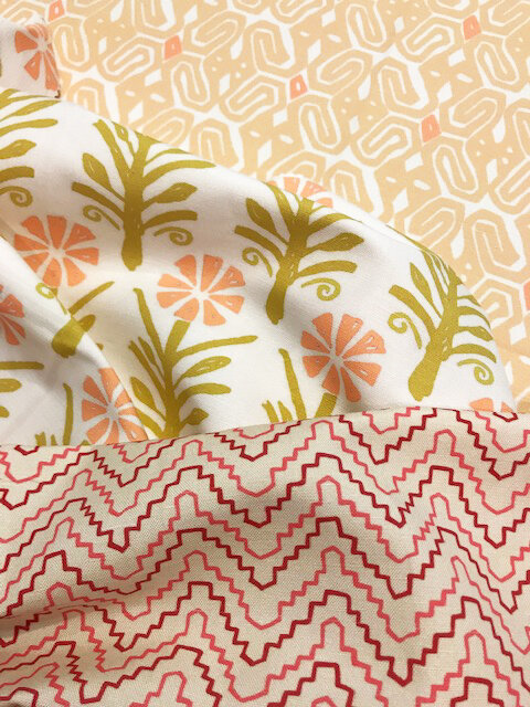
Sneak peek of the new designs for Fall!
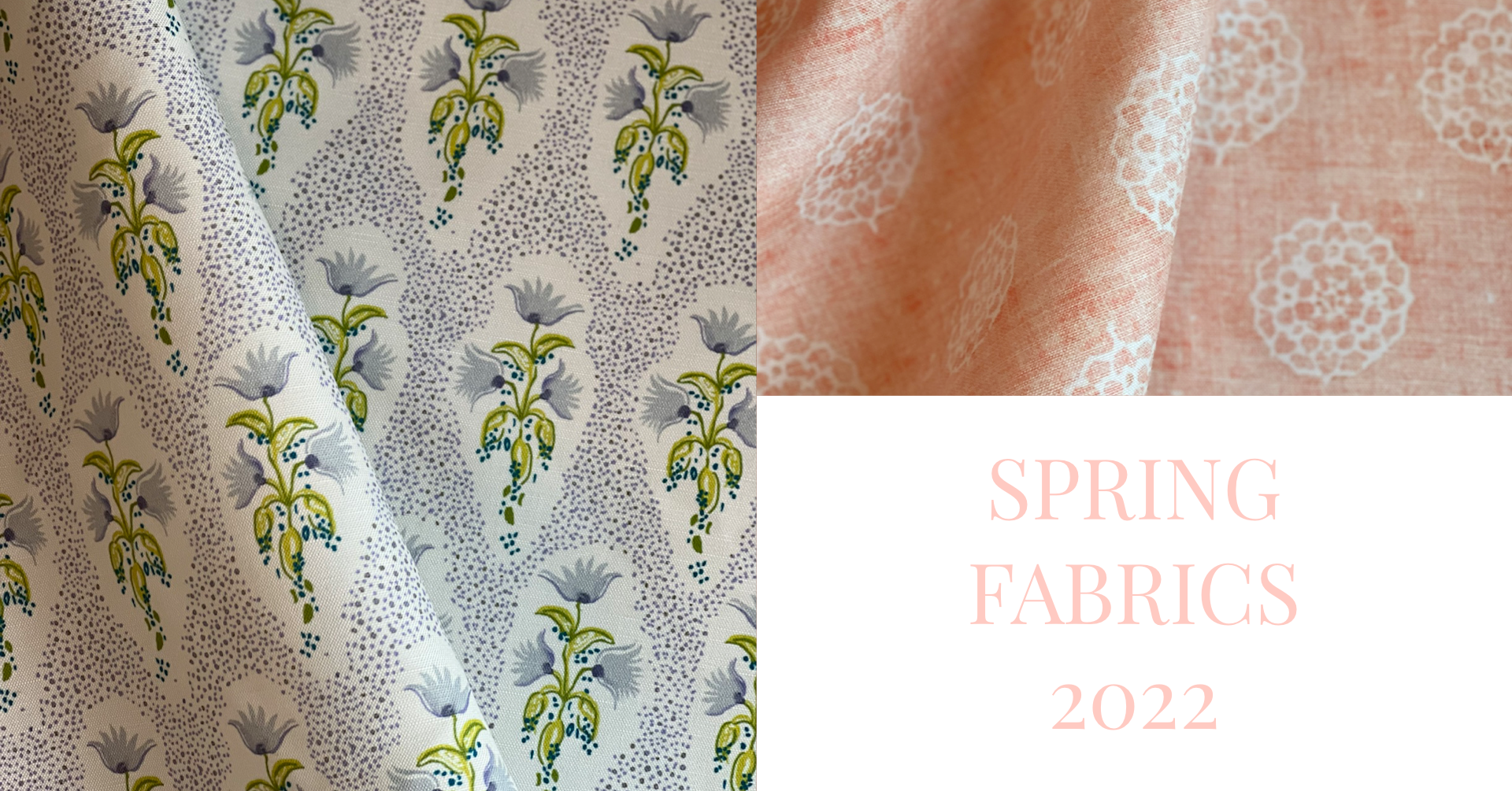
Read MoreSPRING FABRICS 2022 →
Spring is right around the corner and I cannot wait! No, I don’t live in a snowy climate so that I’m snow weary…..and honestly, these days we only get roughly two months of winter. It can be two months with some mighty cold temps thrown in, but it’s not a long winter. It’s gardening that has me looking forward to warmer days puttering with plants, seeds and soil in spring.
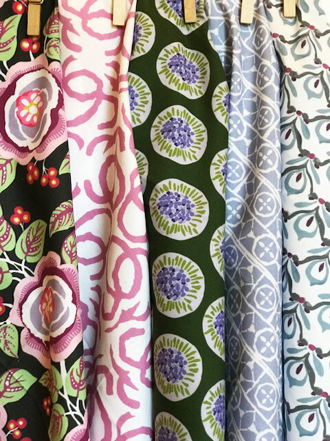
Gardening and introducing new designs! I have so enjoyed working on this group of prints for the last few months. Tweaking colors, scale and waiting for samples to arrive never fails to excite me. It’s a wonderful feeling when the samples are finalized and I get to tell you about the new designs!
This collection of prints has a little bit of everything: sweet and soft florals in lavender, greens and rose… spunky small prints in bold colors…global prints in deep hues of aubergine, indigo and green, new colors for old favorites and a new print in Belgian linen inspired by old world textiles. As with all of my prints, the Spring collection is designed to mix, not match.
I hope you enjoy them!
HOW TO MIX FABRIC COLOR AND PATTERNS

Ever wonder how fabulous rooms full of layered pattern and textiles come together to look, well, fabulous? I am forever bedazzled by the cohesiveness of seemingly unmatched patterns…and there you have it. Unmatched. So how do you create the mix that works together?
I think it’s one part useful guidelines such as these:
Start with an anchor color, then 2-3 more colors and vary the shades of these colors within the patterns you choose. Or if you have a favorite color you can create a harmonious look with various patterns such as geometric, African, abstract, and stripes.
Choose one shade of color and 3-4 patterns in that shade to create a cohesive look.
You can use complementary colors (opposite colors on the color wheel) like green/purple jewel colors or coral/orange to create unity between florals, stripes and geometrics.
When it comes to pattern, you can use one specific style of pattern (such as Turkish kilim) to create harmony.
Vary the style and scale of the patterns you are combining.
And then I think it’s two parts YOU!
“Pattern is really personal, because it tells your story.” Rebecca Atwood
I couldn’t agree more! I truly believe surrounding ourselves with color and pattern we love creates joy in our home! And honestly, while there are many guidelines about the best ways to mix pattern, at the end of the day it’s about what YOU love.
images: La Boheme, Penny Morrison, The Jungalow, Umberto Pasti
CUSTOM COLORS

Hooray, you’re ready to make a change in your home and want to freshen up with new pillows…..or you are ready to recover a chair, sofa, curtains or all of the above. What matters most is finding the fabric/colors that are just right for the feel you are creating in your home. The prints that are just right for YOU.
Love the fabric but need a different color? Custom colorations are welcome at Paprika Home! Let’s get started.

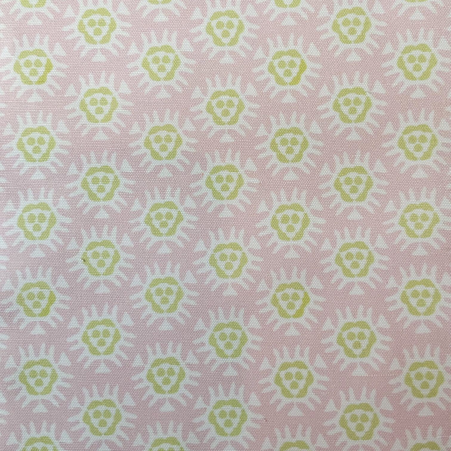
Melika is part of the swatch collection a designer uses to show my fabrics. Both the designer and her customer loved Melika but they needed a buttery yellow color rather than a chocolate brown.
The first step is pinning down the yellow color. In this case, color chips were mailed to me to work from.
The next step for me is to match the color chips as closely as I can and to send digital files for approval. Sometimes colors are tweaked and additional files are sent. Once we are all happy with the color matching I have two samples printed on the fabric we will be using, one for each of us, so that we are on the same page. Final colors are chosen from the swatch.

It’s so exciting to see your vision come to life, so the next step is the one I love most. What is it? The day you hold a swatch of Melika in the new buttery yellow in your hand and see it in your home. Woo hoo!!
All that’s left is final approval and we’re off to printing the yardage. Yep, that’s it!
Last but not least, if it isn’t possible to send actual color chips for matching, I gotcha covered!

I can send you a Color map file with a large range of colors for printing. The numbers you see on each color rectangle are HEX codes used industry wide. These codes identify each color when it comes time to print. Once again, because colors can print differently than they look on a screen, swatches guarantee how your final fabric will print.
Hooray, now you know that a color change is not complicated! It’s really quite fun. If you have any questions, let me know!
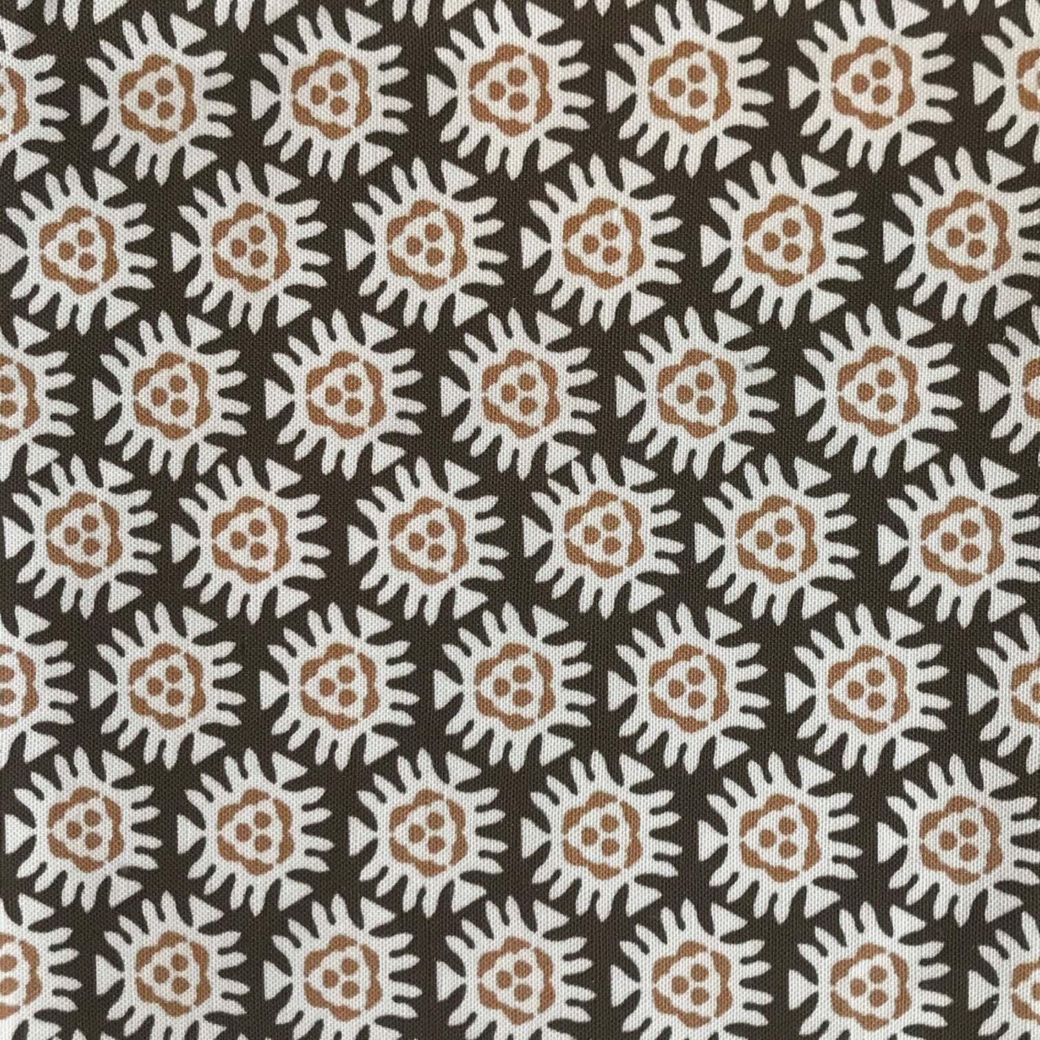
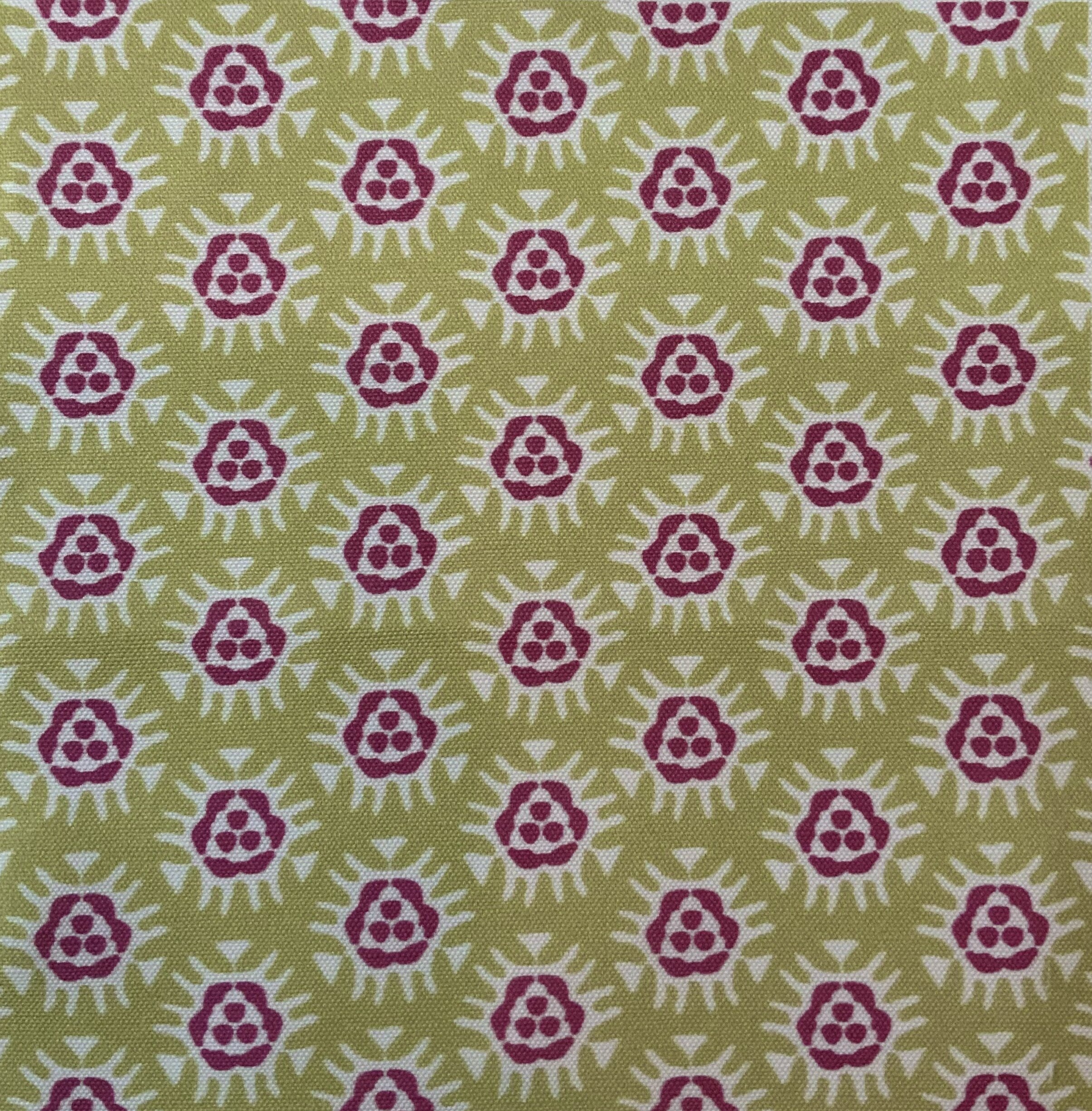
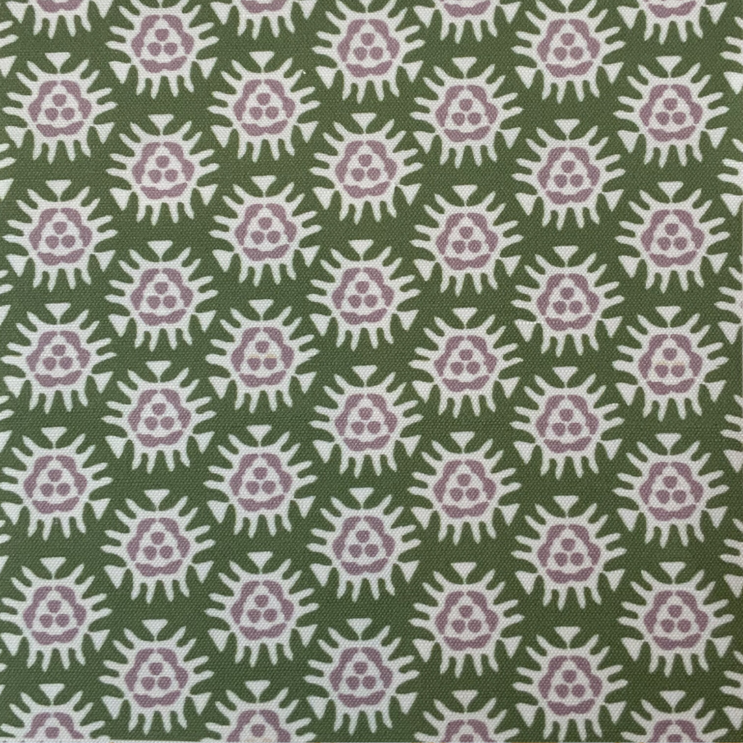
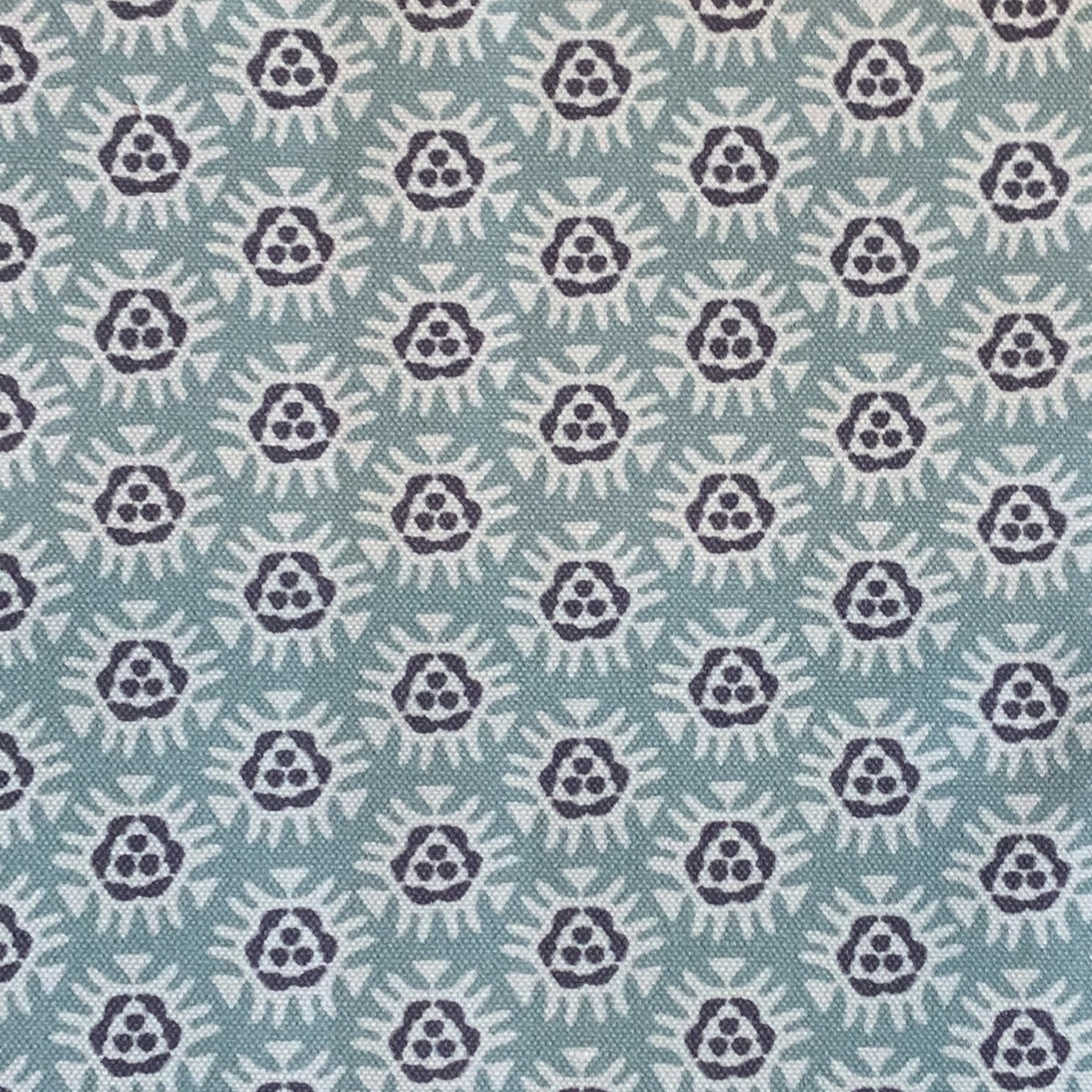
MELIKA
It’s a new year and so many new things are on the horizon! Let’s start with the newest colors for a favorite print, Melika: Chocolate, Jewel, Rosecloud, Forest and Blue. What do I love about Melika? I think it’s a great stand alone print AND a perfect companion print to most of the Paprika Home fabrics. It is a small scale print with an repeating icon that is grounding in it’s simplicity and global in feel, which means it works in so many different decor styles. Click on the image to see the colors. And did I mention I do custom colors?? Yep, if the color you need is not among the five colors offered, send me an email at paprikahome@paprikahome.net and let’s have some fun!
FABRICS
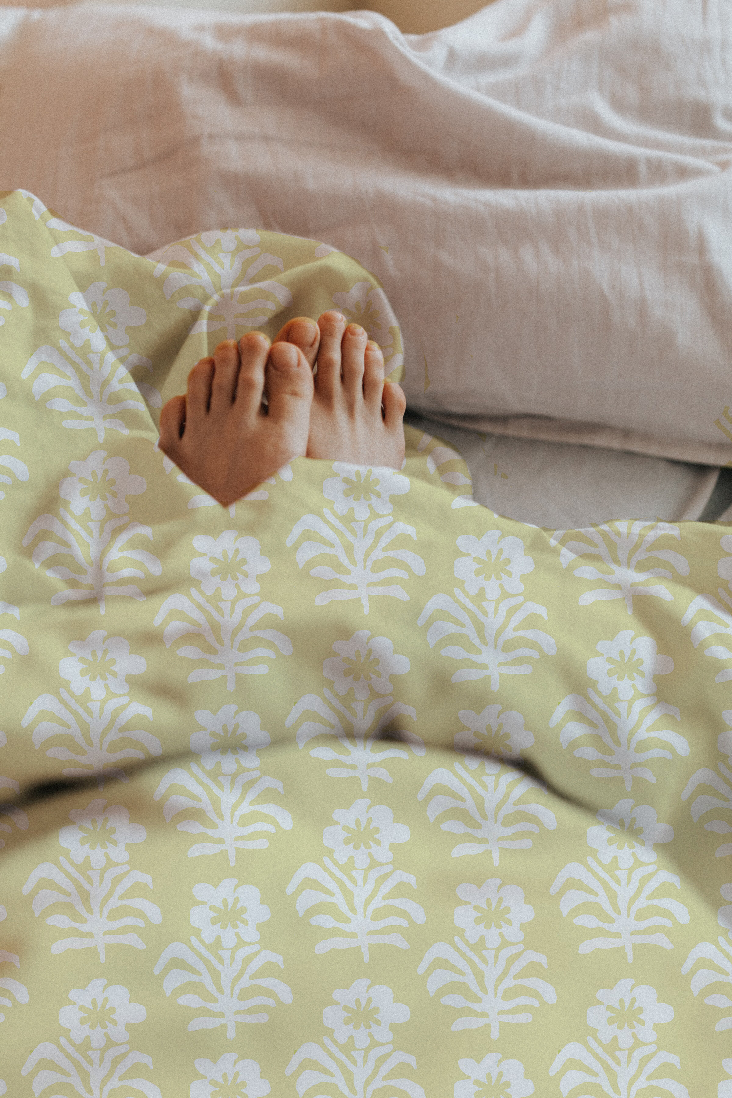
I absolutely love to do a mock up to visualize how a fabric print will look in use. Practically speaking, it’s a wonderful way to quickly see if the scale needs to be tweaked or if any other changes should be made. I’ll admit I’ve gone back to the drawing board more than once. But it’s also just plain fun and downright exciting to see a design come to life on a pillow, bedding, curtains, or chair as well as a great way to show YOU how the prints will look. Featured here are: Aztec blue, Ani spring green and Annabelle blue. Of course, there are many more lovely prints to choose from, so I promise you I will be posting more! Let me know what you think!
Shout out to the generous photographers at Unsplash for providing access to some great photos to use.
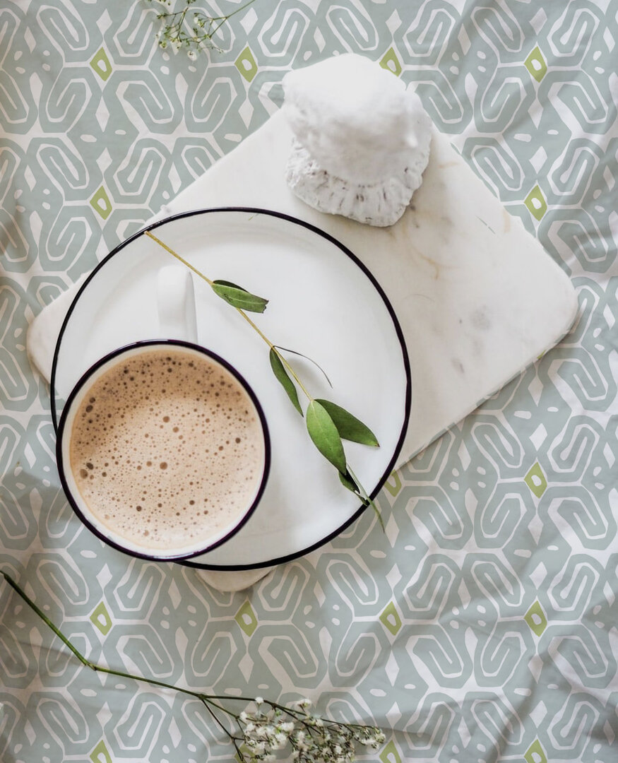
COLOR INSPIRATION OF THE DAY
I hope everyone is doing well! Louisiana is gradually reopening. Slow and steady is the word.
One of the perks of slowing down for me has been the time to play around with a few new designs and presentations. In that spirit I thought it might be fun to take a look behind the scenes at how some of the prints come together.

First of all I am always gathering inspiration. Always. I follow designers, read design magazines and books, peruse Pinterest and Instagram daily and am forever excited by the immense creativity I see. I keep tear sheets that inspire me in files, I hang them on my walls, I take pictures of color combinations I find appealing when I’m out and about. I have a large table in my studio I made from doors and it is my everlasting joy to leave clusters of ideas in various spots to percolate. This is a wonderful process for me because I need to live with the “story” as it develops.
Once the story coalesces into a feeling the real beginning of a design takes shape in my mind. It always involves a feeling, motifs that express the feeling, and colors the feeling evokes. A mood/color board like the one I posted becomes the guide for, in this case: pastel colors, a pop of color, and a relaxed vibe with a slightly global feel. But to be perfectly honest, I most often work from the tear sheets taped to a poster board so I can add/subtract sheets as I progress. It’s much more informal, but a board nonetheless.
I think about where the fabric or pillow will be used. Sometimes that influences the color, but really in the end I lean into where my instincts take me. I don’t necessarily build a collection although yes, some designs are meant to work together, but honestly I prefer the happy coincidence of patterns and colors working together. I’m not overly concerned with being trendy when it comes to what I design for Paprika Home. I love what I love and go with the flow when what I love changes. It’s a pretty good gig and it works for me.
Hope y’all have a wonderful weekend!
credits: Cottage veranda chair: mainlybaskets.com | La Jolla basket: Serena and Lily | dishes: mydesignchic.com | door: Pinterest
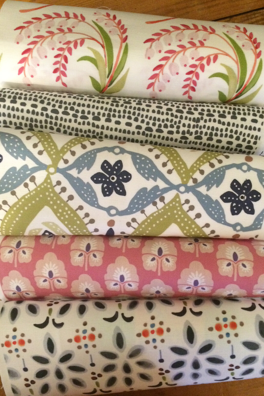
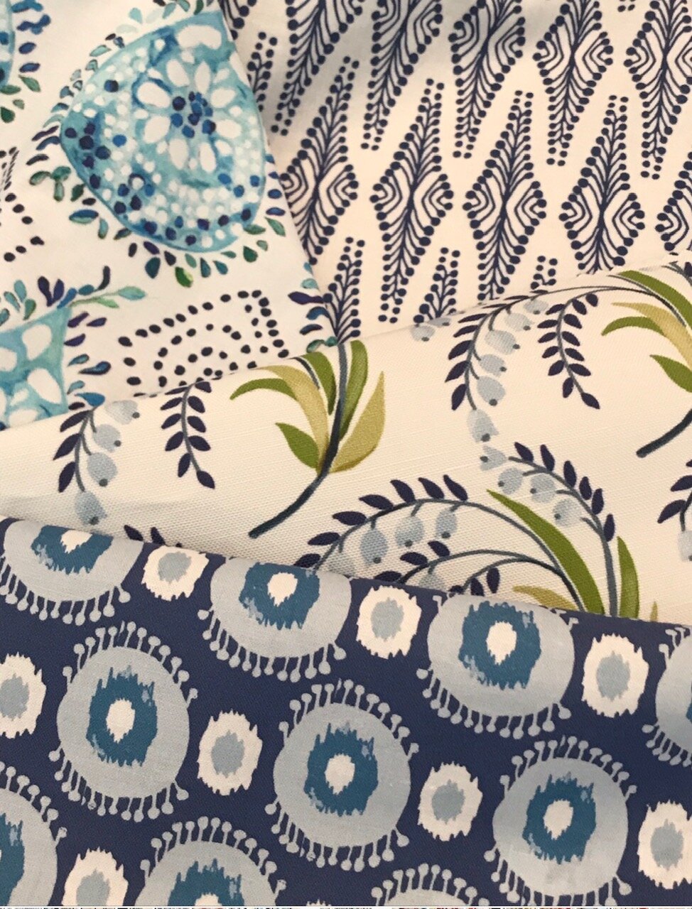
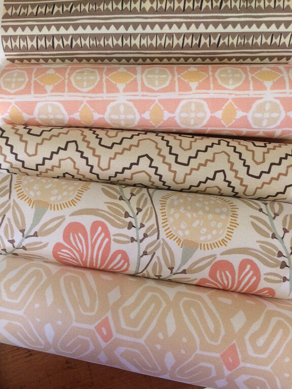
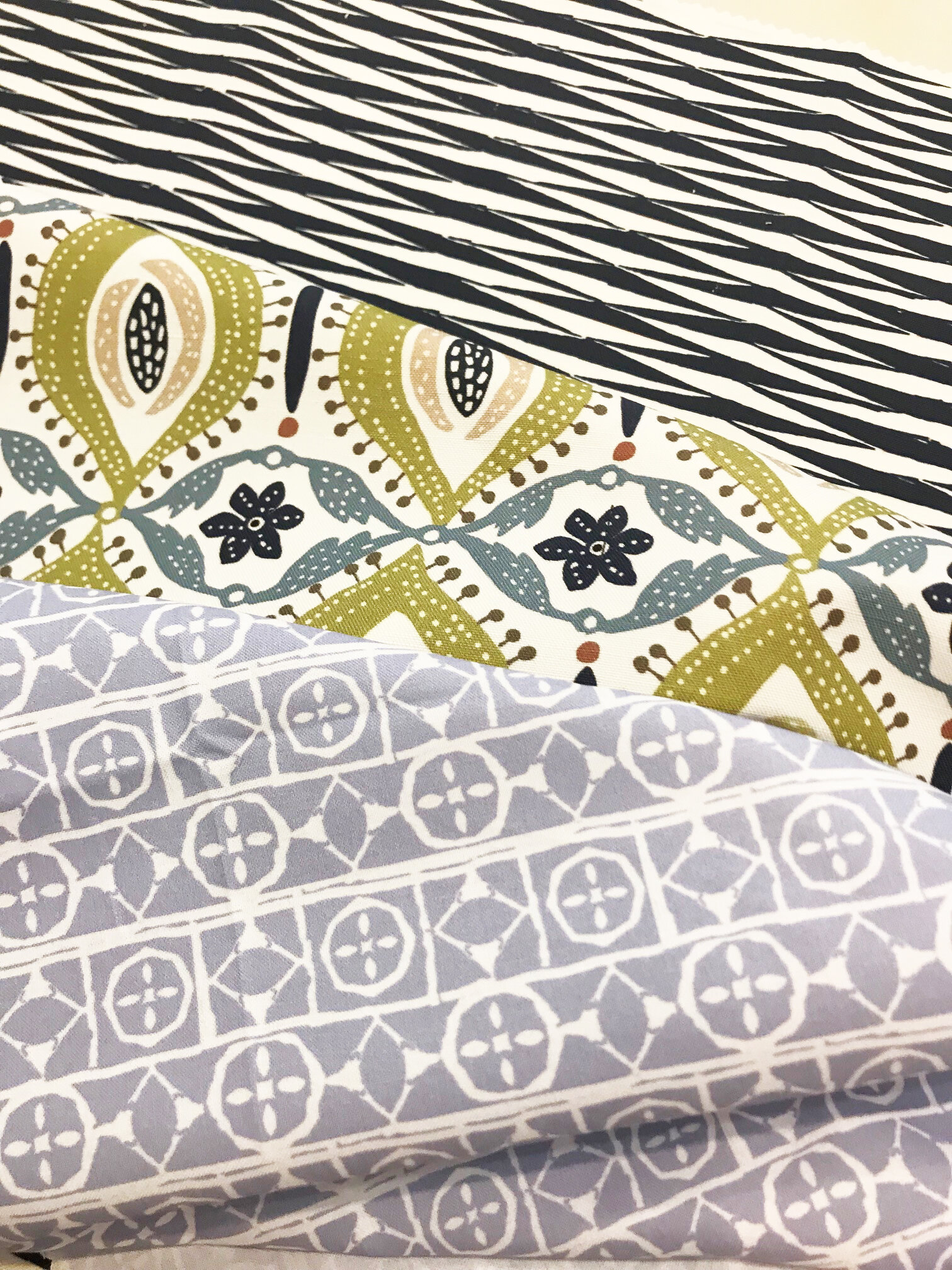
FABRICS
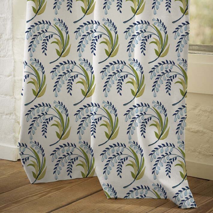
I thought it would be fun to show you some of my favorite fabric photographs. I always delight in the mix of color and pattern in the prints. All fabrics are print to order so just in case you don’t see the right color for your home, we offer a custom option. The possibilities are endless. Click on the images for a slideshow!!