SPRING 2023

What’s new for spring? Glad you asked!

It’s hard to believe but spring is right around the corner! I know, there is another Arctic blast blowing in, but spring is coming. It’s a welcome season when the natural world wakes up, temperatures gradually rise and we are all invigorated after the winter months. The world feels fresh and new…and so do we!

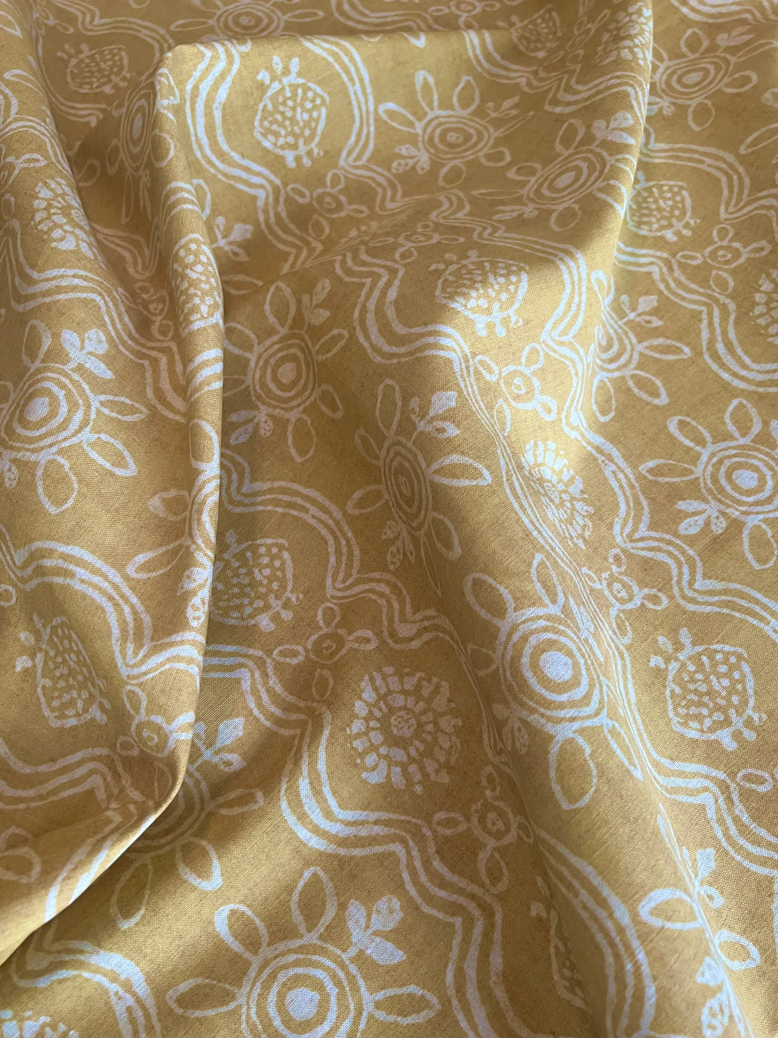
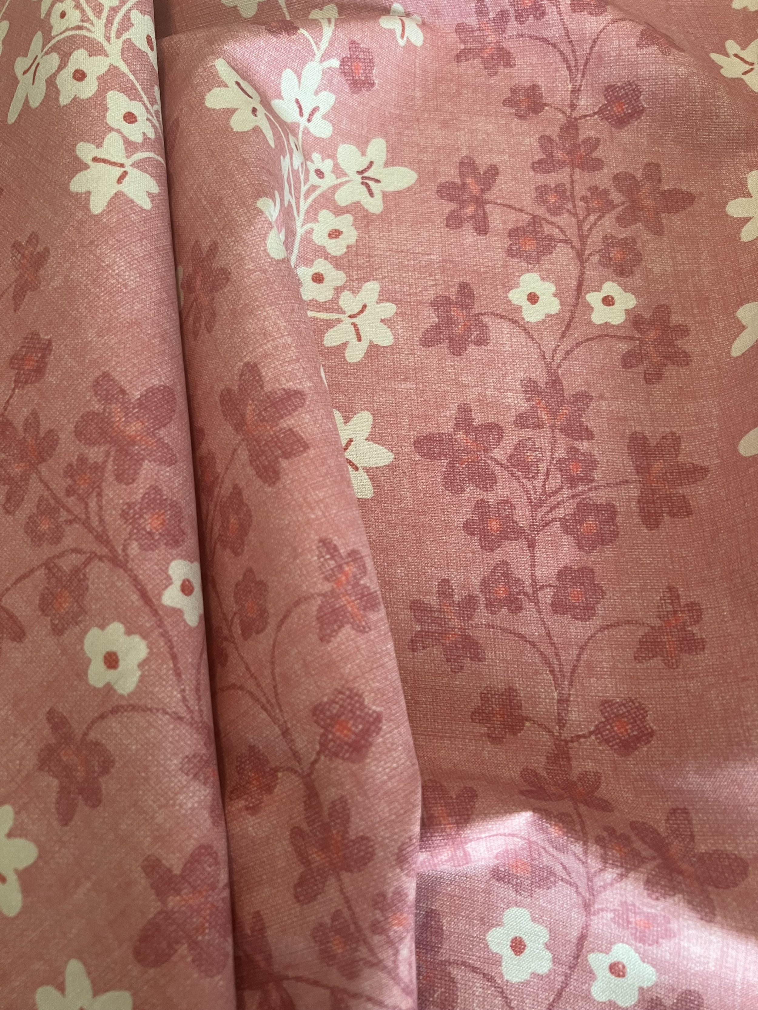
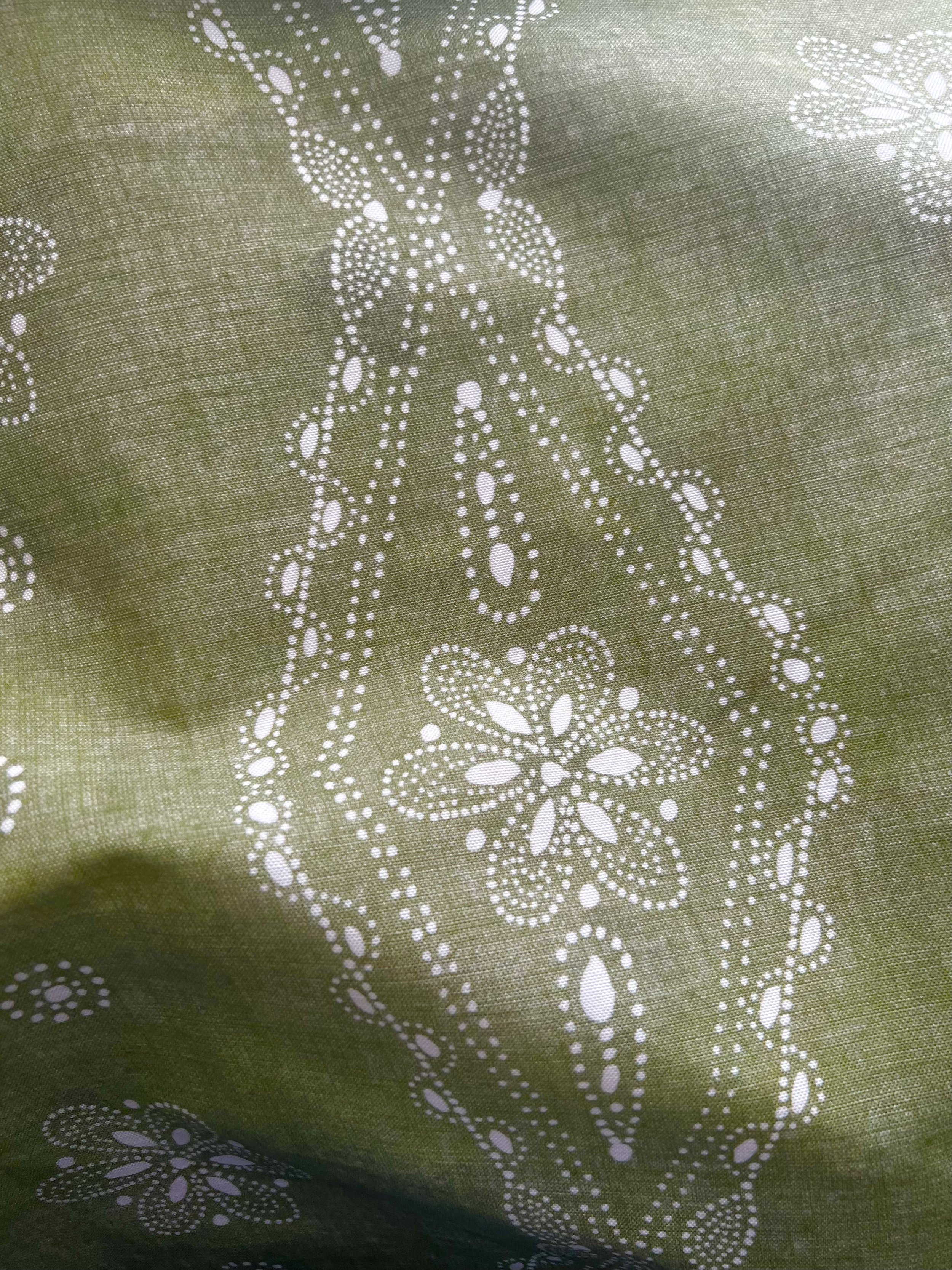
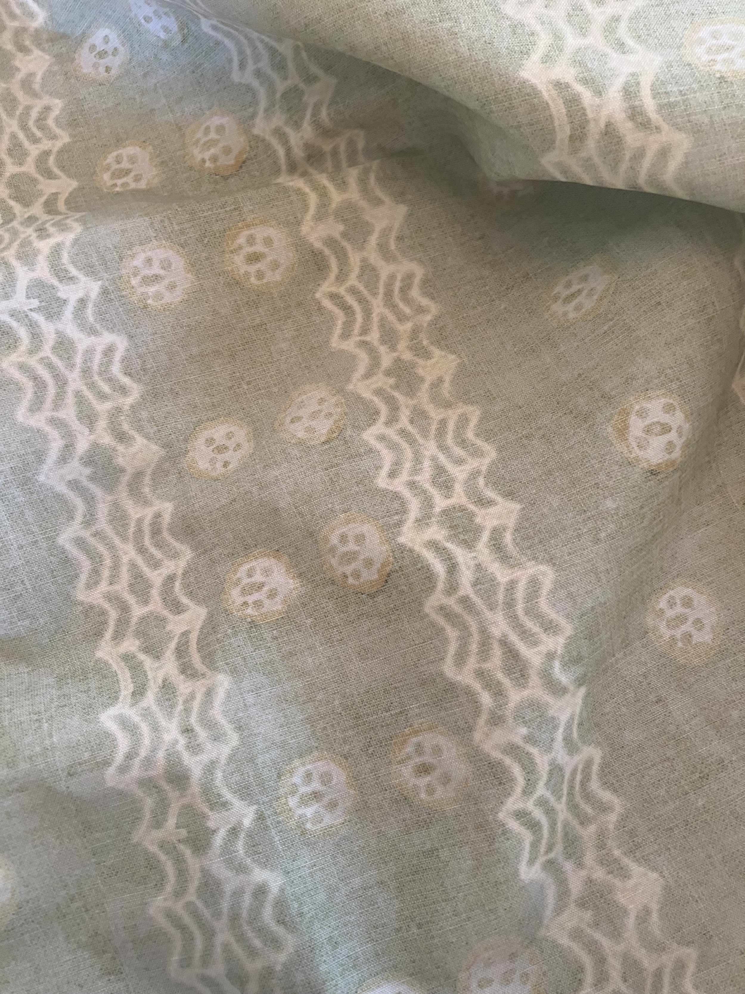
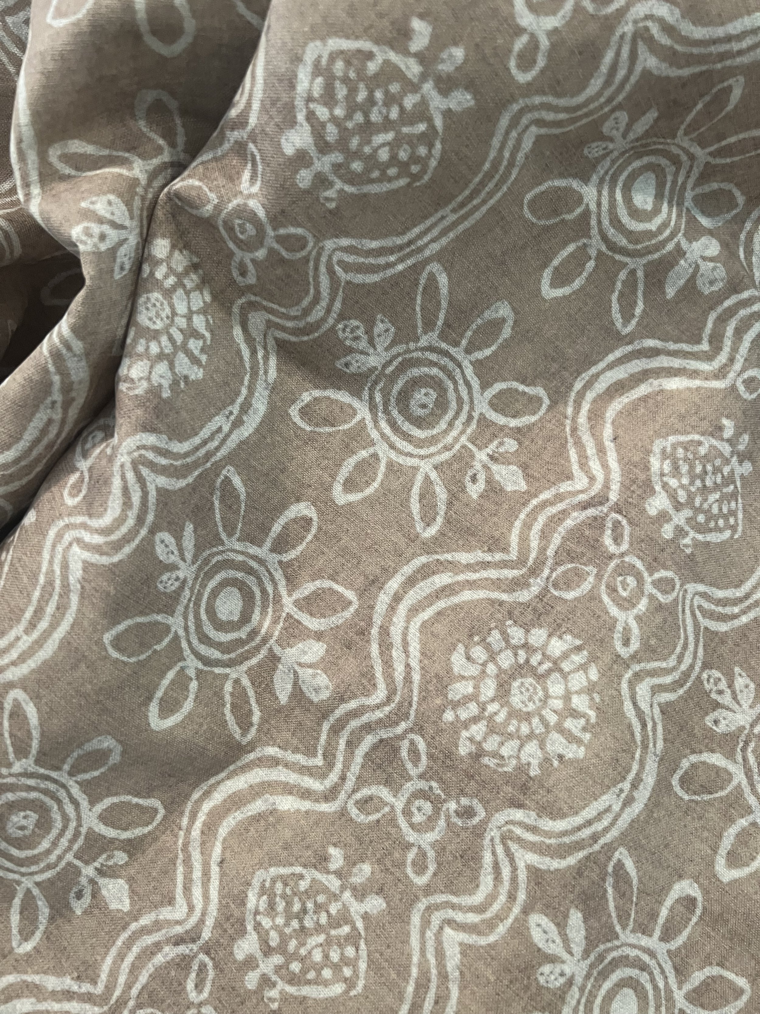
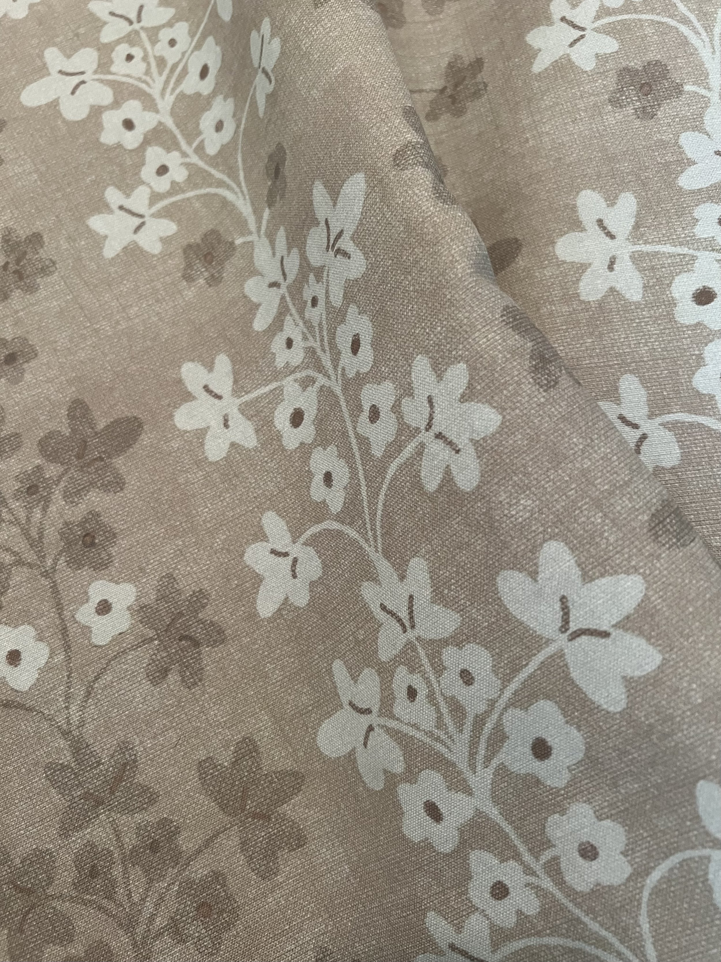
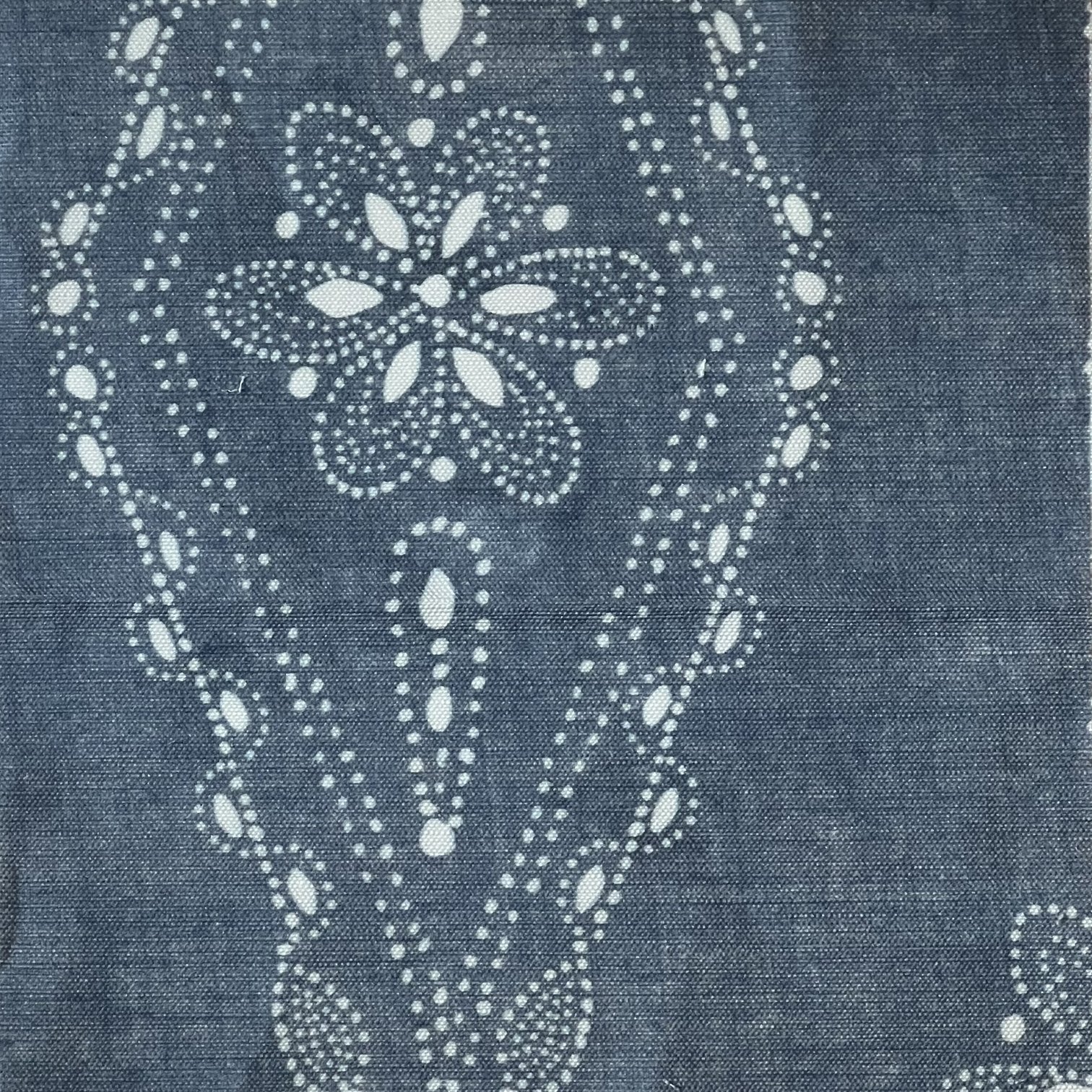
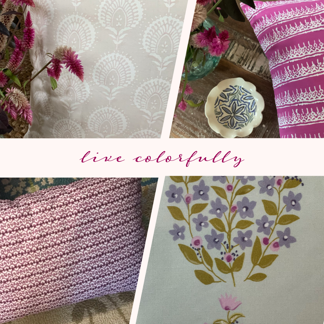
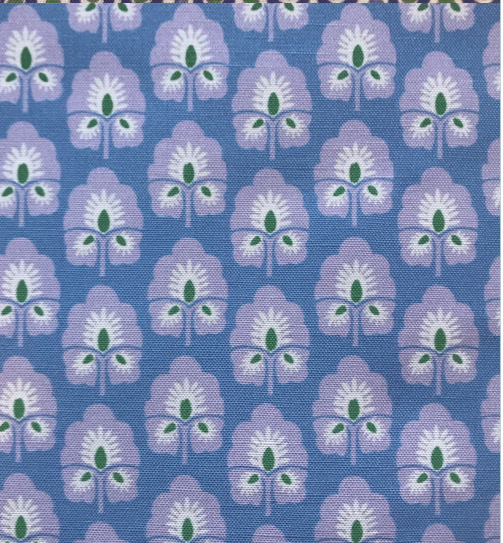
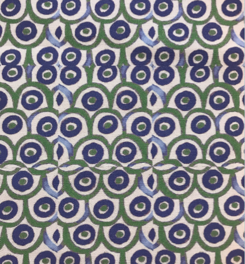
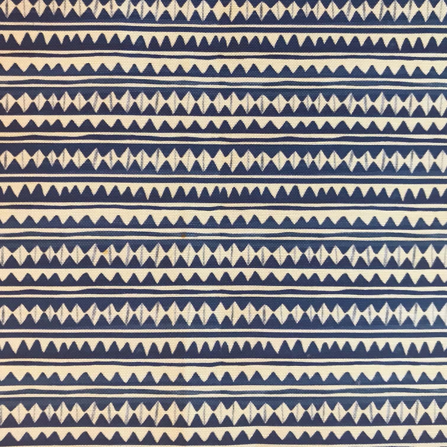
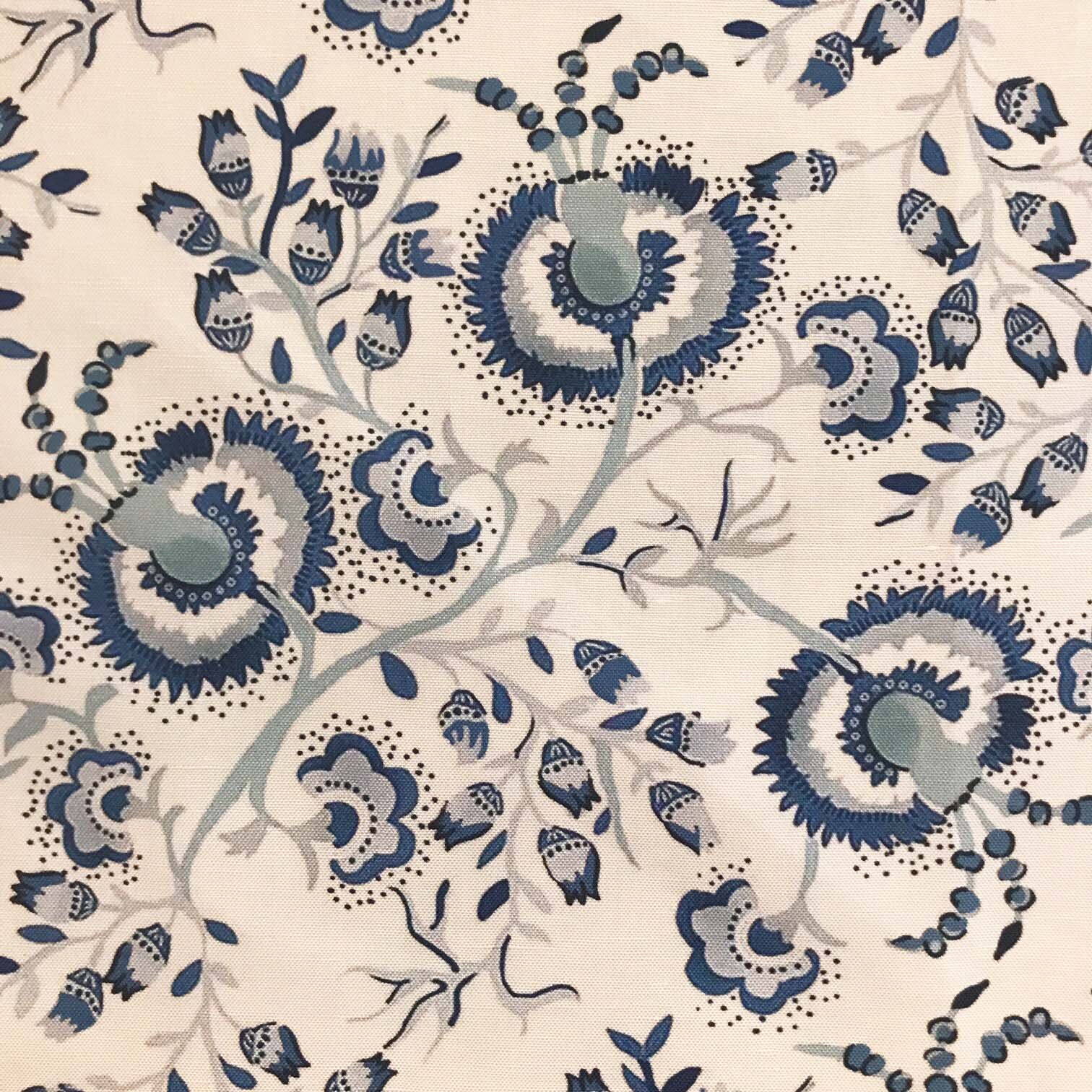
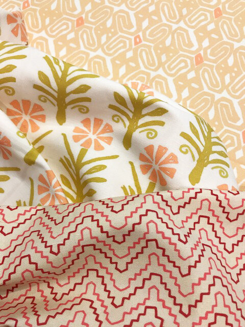
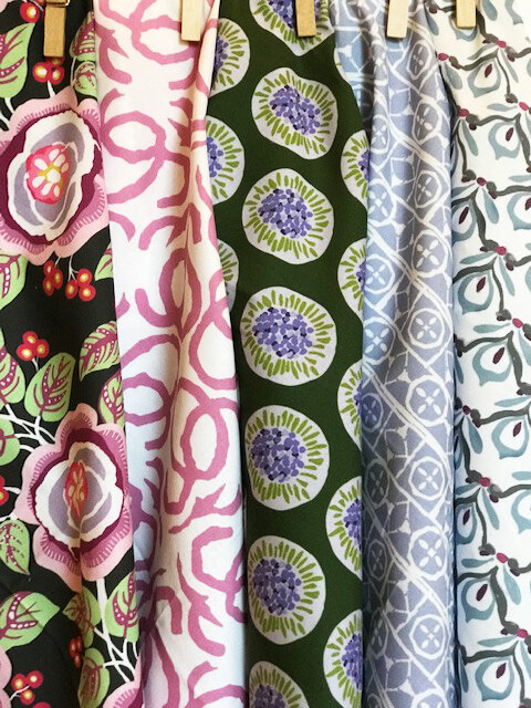
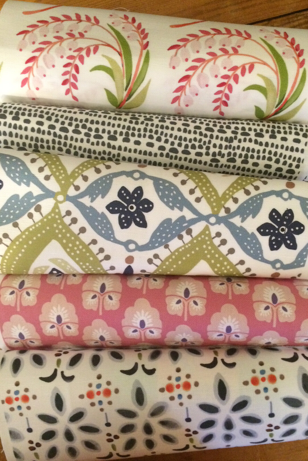
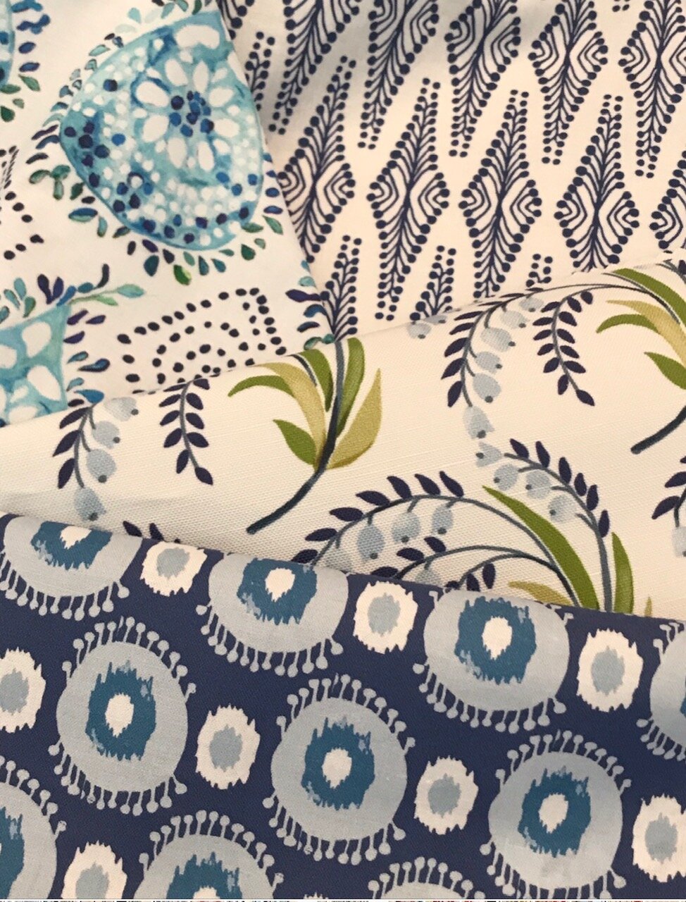
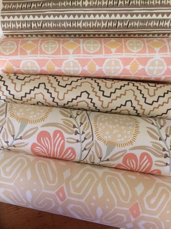
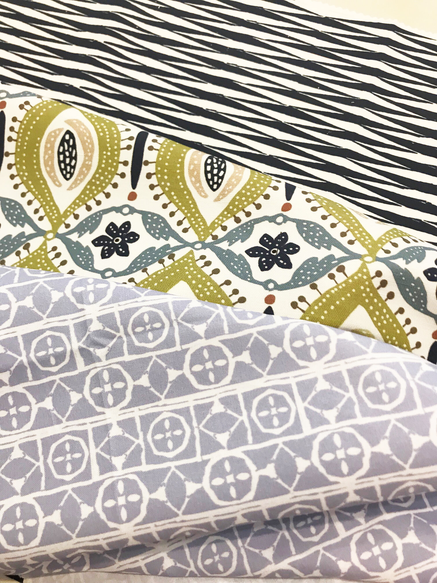
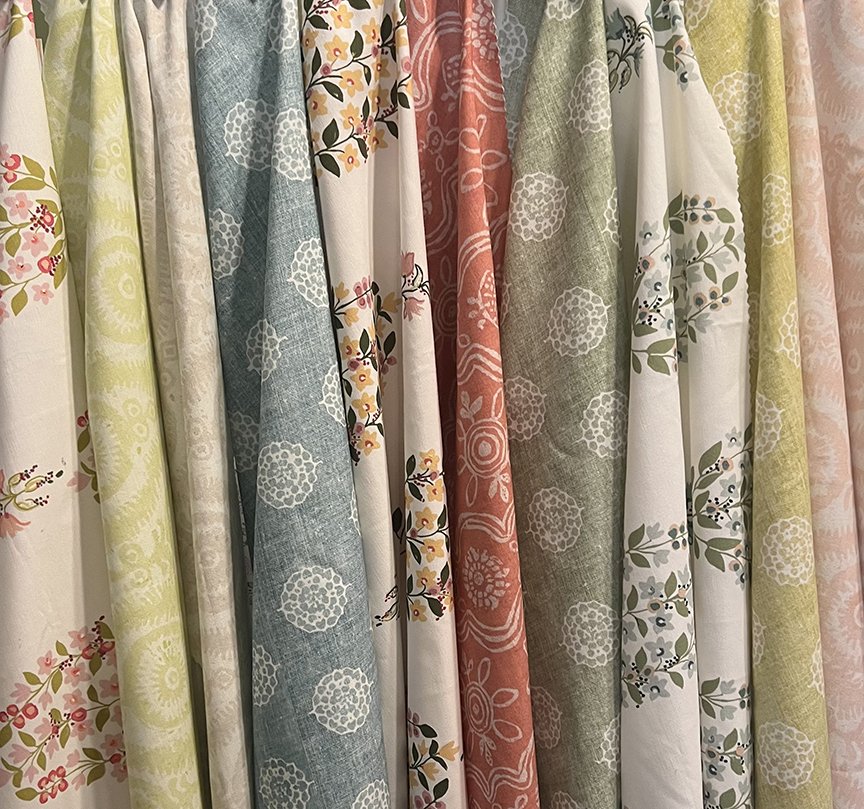
And speaking of new, it’s been a busy couple of months for Paprika Home! First of all, the Spring 2023 Collection introduces new colors to some of your favorites. Esola and Chloe are now available in four beautiful colorways. Sarina now comes in Blush and a gorgeous tone of coral/red called Siesta is offered on Malabar. All designs are printed on a lovely Linen Cotton blend and a luxurious 100% Belgian Linen. And now, wait for it….

A 100% Cotton that is super wide, 116” to be exact! Yes, 116” wide!! How cool is that?? Just think about the possibilities…tablecloths, bedspreads, draperies…So. Many. Ideas.

I’m also excited to let you know that Afterpay is now offered at checkout for your convenience. At the moment it is only available for fabric purchases. Pillows will be added soon!

I hope you enjoy perusing the new colors and fabric options. As always, if you have any questions please send me an email and I’ll be happy to help!

Enjoy!

FALL 2022 COLLECTION

The end of September is right around the corner, cooler temps are on the way ( I hope!!) and the Fall Collection is here! Rich hues of color and a combination of motifs ranging from dancing florals to muted tribal feeling icons define this collection. From left to right: Malabar Goldenrod, Rani Pastel Brick, Rilden Moss, Sarina, Malabar Heather, Rani Cashmere and Rilden Indigo. I’m hard pressed to pick a favorite here and I will be adding new colors during the year to some of these. Or maybe all of these!! Printed on a cotton linen blend, the new prints ship within 2-3 weeks. Swatches are available to order if you need to check out the fabric color in your home. And don’t forget all of my prints are available on 100% Belgian linen as well.

I hope you love the new prints as much as I do!

LIVE COLORFULLY

COLOR, color, color…..true confessions, I don’t think there is a color I don’t like. That doesn’t mean I want to live with every color though, and most of us don’t. We all gravitate towards some colors more than others, and finding the blend that sings your song can truly bring your comfort level to new heights.

After all, home is the place we relax and enjoy family and friends. It’s the place we recharge and rejuvenate. Color plays an enormous role in creating our comfort zone and if you need help finding your happy place with color, you are not alone! Send me an email and I’m happy to help!

HOW TO MIX FABRIC COLOR AND PATTERNS

Ever wonder how fabulous rooms full of layered pattern and textiles come together to look, well, fabulous? I am forever bedazzled by the cohesiveness of  seemingly unmatched patterns…and there you have it. Unmatched. So how do you create the mix tha…

Ever wonder how fabulous rooms full of layered pattern and textiles come together to look, well, fabulous? I am forever bedazzled by the cohesiveness of seemingly unmatched patterns…and there you have it. Unmatched. So how do you create the mix that works together?

I think it’s one part useful guidelines such as these:

Start with an anchor color, then 2-3 more colors and vary the shades of these colors within the patterns you choose. Or if you have a favorite color you can create a harmonious look with various patterns such as geometric, African, abstract, and stripes.

Choose one shade of color and 3-4 patterns in that shade to create a cohesive look.

You can use complementary colors (opposite colors on the color wheel) like green/purple jewel colors or coral/orange to create unity between florals, stripes and geometrics.

When it comes to pattern, you can use one specific style of pattern (such as Turkish kilim) to create harmony.

Vary the style and scale of the patterns you are combining.

And then I think it’s two parts YOU!

“Pattern is really personal, because it tells your story.” Rebecca Atwood

I couldn’t agree more! I truly believe surrounding ourselves with color and pattern we love creates joy in our home! And honestly, while there are many guidelines about the best ways to mix pattern, at the end of the day it’s about what YOU love.

images: La Boheme, Penny Morrison, The Jungalow, Umberto Pasti

THE COLOR BLUE

Blue…..It is said to be the worlds favorite color. And little wonder as it’s a color that evokes feelings of calm, peace and relaxation. Who doesn’t want that? Whether you surround yourself with blue in your home or simply add touches of it here and there, it’s a color that works for everyone. Most blues are a mix of other colors, namely violet and green. Blue and white is the classic combination but blue can really pack a punch mixed with mustard, pink, corals…..The choice is yours!

We have a lovely selection of blue fabrics and pillows to choose from on our website. Hope you find just what you want!

all fabric images are Paprika Home

all other images via Pinterest

OCHRE

Hard to believe that Fall is really on it’s way! But it’s true. The light has shifted and I find myself drawn to earthy colors that are both grounding and cozy. Colors like ochre, buttery yellow, mustard, amber, beiges that give off a warm glow like our fabrics in the collage. Today I read that the Farmer’s Almanac predicts a very, very cold and long winter. Hmm…guess we’ll have to wait and see. While we tend to have mild winters in Louisiana, anyone from here knows “ that bone-chilling” cold we sometimes have. The kind that makes you want to hunker down indoors with a good book and a steaming cup of tea…I do love all things Fall though, so bring it on!

My Post (78).png