MARDI GRAS HOUSE FLOATS

I know, this has nothing to do with fabric….BUT it has everything to do with joyful living and it’s just too good not to share!

What happens when Mardi Gras is cancelled? The people of New Orleans celebrate anyway! Come on, it’s New Orleans!! If the Mardi Gras floats cannot parade through the streets of NOLA the “house floats” will parade for our enjoyment. Neighborhoods full of gloriously and imaginatively decorated homes are beaming out joy and glee to the city of NOLA and beyond. These fun photos are shared by Nolaadore and Nola_val. Honestly, it’s tough to select which to post as they are truly all magnificent. I hope you find them as uplifting as I do, particularly at this moment in time. Click on the images to see the slideshow and enjoy. Laissez le bon temps rouler!!!

MELIKA

It’s a new year and so many new things are on the horizon! Let’s start with the newest colors for a favorite print, Melika: Chocolate, Jewel, Rosecloud, Forest and Blue. What do I love about Melika? I think it’s a great stand alone print AND a perfect companion print to most of the Paprika Home fabrics. It is a small scale print with an repeating icon that is grounding in it’s simplicity and global in feel, which means it works in so many different decor styles. Click on the image to see the colors. And did I mention I do custom colors?? Yep, if the color you need is not among the five colors offered, send me an email at paprikahome@paprikahome.net and let’s have some fun!

NEUTRAL GROUND

Fall is most definitely here. Normally hurricane season is winding down even though it isn’t officially over until November. As 2020 continues to surprise, or not, Zeta is headed my way and will make landfall tomorrow evening. I’ve seen Louisiana in the path of a hurricane too many times this summer to keep count. It’s been that kind of crazy. Honestly, after taking down mobiles and moving various garden decor for the third time I didn’t bother putting it all back…just in case. The good news is that it is fast moving and predicted to weaken before landfall. So there’s that.

Fall colors are soothing and grounding. Today I need that. I found this image of gorgeous baskets and had to build a story around them! I’m calling it NEUTRAL GROUND with an emphasis on ground. Rattan is a natural with these colors. Hope this storyboard offers some grounding to you as well!

credit: Baskets | ItalianBark.com;  Pillows | Paprika Home;  Round roof | J. Gerke flickr

credit: Baskets | ItalianBark.com; Pillows | Paprika Home; Round roof | J. Gerke flickr

FABRICS

I absolutely love to do a mock up to visualize how a fabric print will look in use. Practically speaking, it’s a wonderful way to quickly see if the scale needs to be tweaked or if any other changes should be made. I’ll admit I’ve gone back to the drawing board more than once. But it’s also just plain fun and downright exciting to see a design come to life on a pillow, bedding, curtains, or chair as well as a great way to show YOU how the prints will look. Featured here are: Aztec blue, Ani spring green and Annabelle blue. Of course, there are many more lovely prints to choose from, so I promise you I will be posting more! Let me know what you think!

Shout out to the generous photographers at Unsplash for providing access to some great photos to use.

MONDAY MOOD BOARD | ANKARA

I cannot believe it is August!! It has certainly been a strange summer for everyone and a sense of time is thrown all off balance. Here in Louisiana we are settling into our hottest weather of the year. The light has changed….a reminder that cooler days will come. Probably not until October, but they will come. I love Ankara in moss/blush because it’s such a lovely design for both summer and fall. It’s a lively floral yet the colors are neutral and calm. This is a pillow that is at home in both a living room or a bedroom. Relaxed living is what Paprika Home is all about!

Paprika Home Ankara mood board.png

BOLD COLOR INSPO

Talk about a pop of color! There is bold, bold, b.o.l.d. color going on here!! Tones of red-violet can range from a deep merlot to orchid to fuschia and are usually used as a accent color. Usually…….Pillows in Lamona and Keely are a fun way to bring some lively pizazz into your home. And an easy way too!

credits: green door:jagma55.tumbler.com……..moroccan scene: www.chrystal-clear.com

credits: green door:jagma55.tumbler.com……..moroccan scene: www.chrystal-clear.com

COLOR INSPIRATION OF THE DAY

I hope everyone is doing well! Louisiana is gradually reopening. Slow and steady is the word.

One of the perks of slowing down for me has been the time to play around with a few new designs and presentations. In that spirit I thought it might be fun to take a look behind the scenes at how some of the prints come together.

Paprika Home Color inspo 1.jpg

First of all I am always gathering inspiration. Always. I follow designers, read design magazines and books, peruse Pinterest and Instagram daily and am forever excited by the immense creativity I see. I keep tear sheets that inspire me in files, I hang them on my walls, I take pictures of color combinations I find appealing when I’m out and about. I have a large table in my studio I made from doors and it is my everlasting joy to leave clusters of ideas in various spots to percolate. This is a wonderful process for me because I need to live with the “story” as it develops.

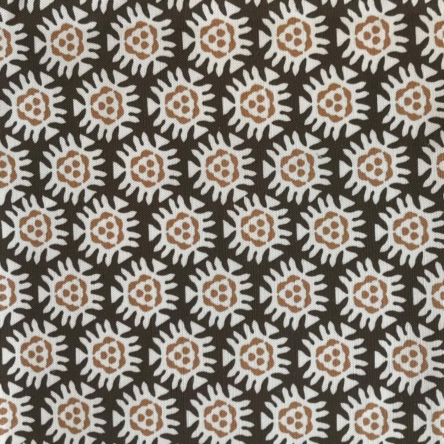
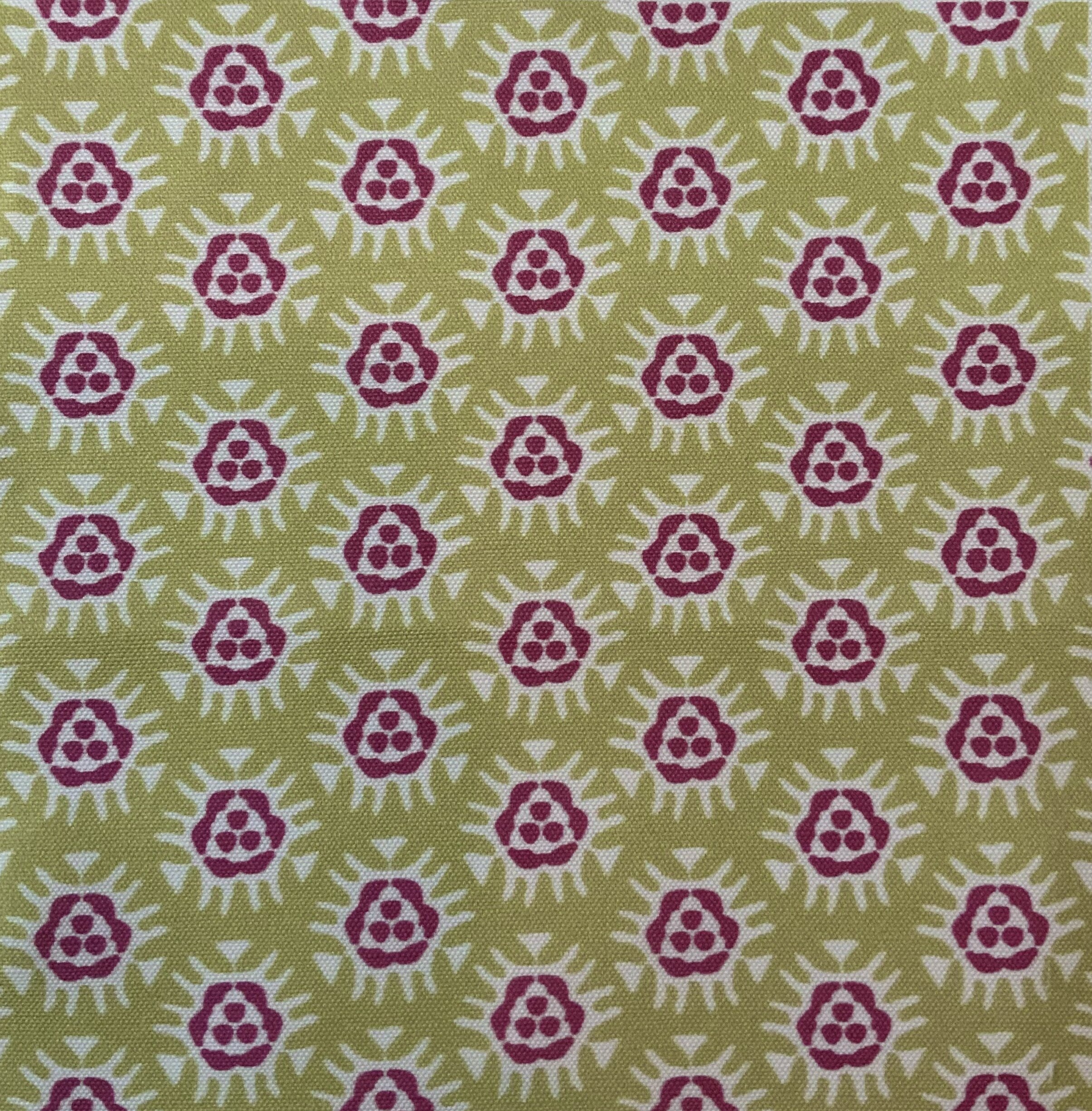
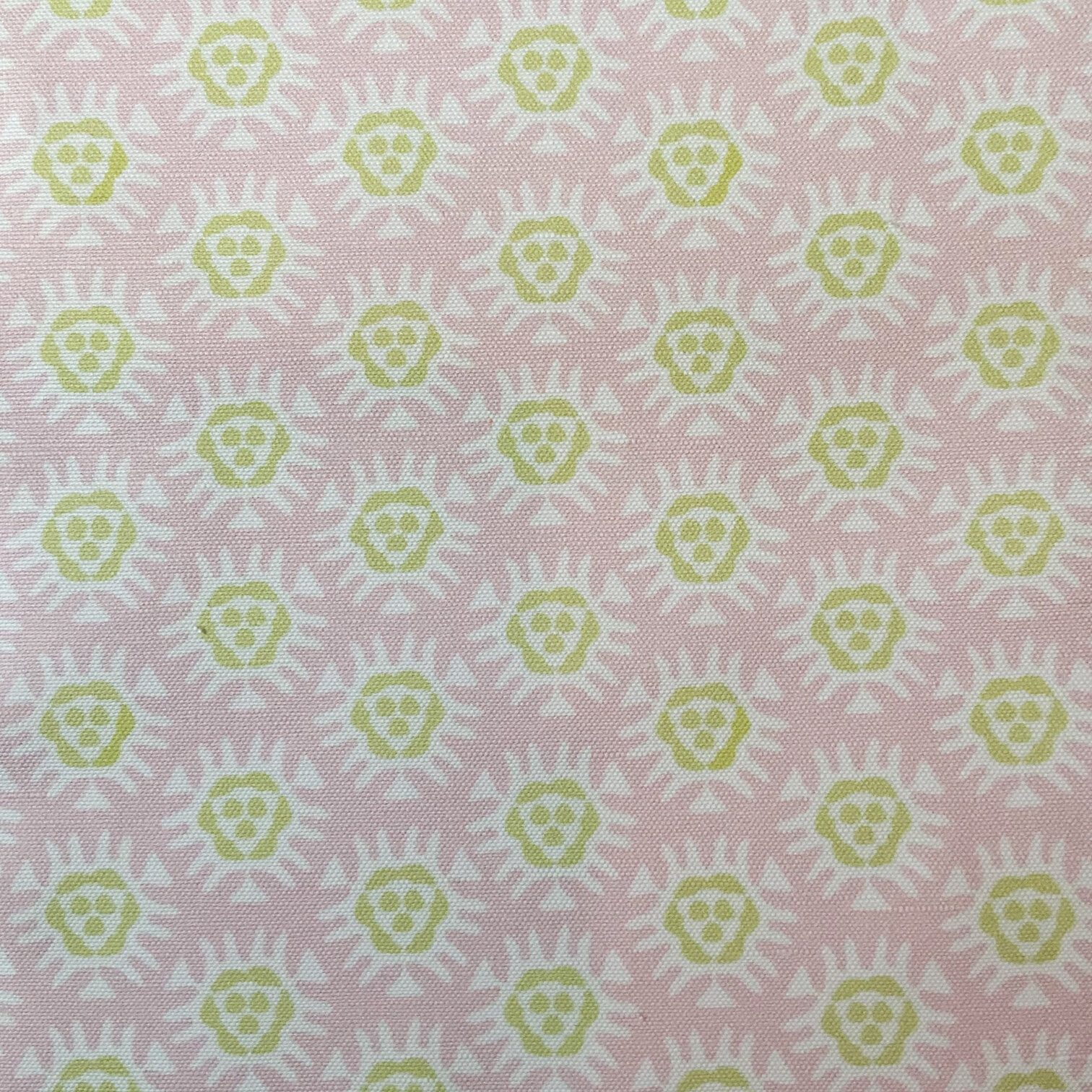
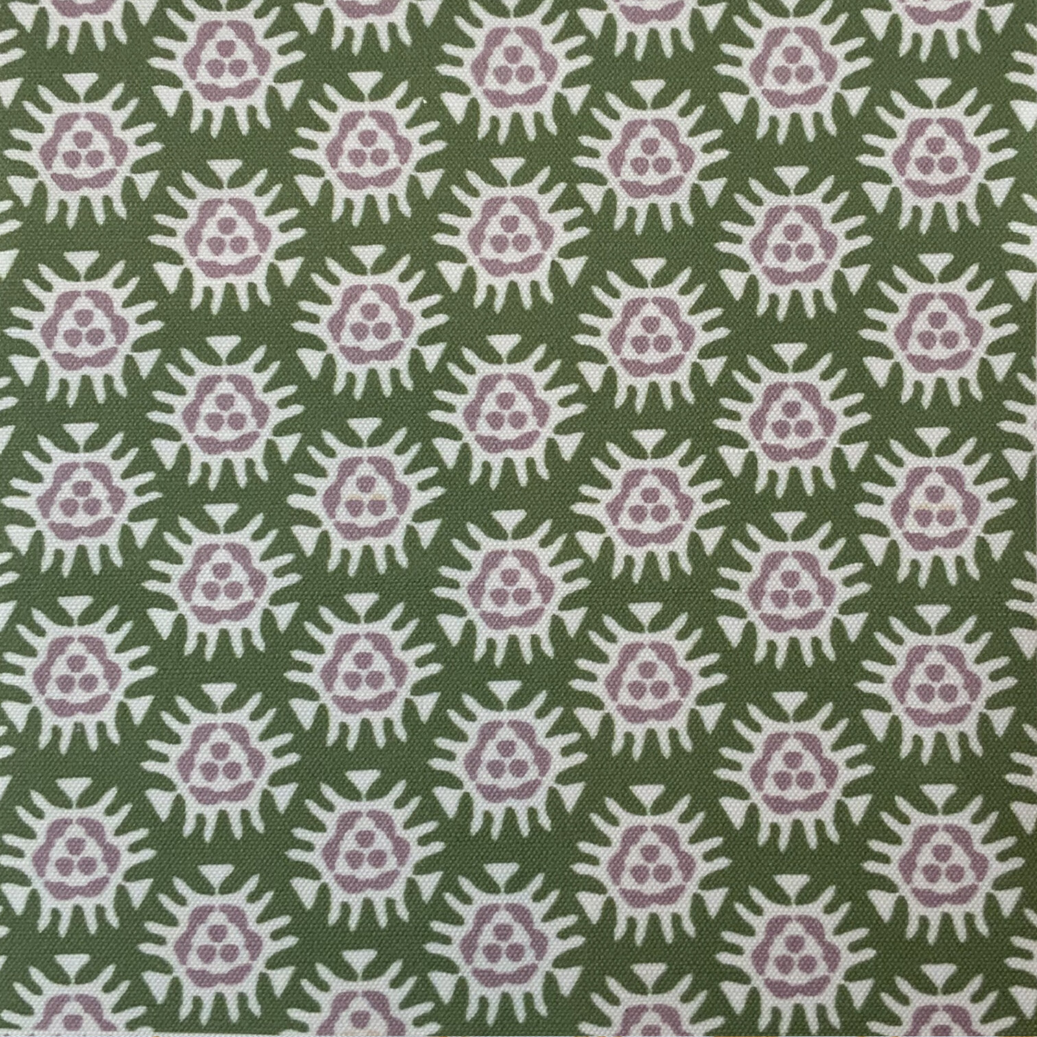
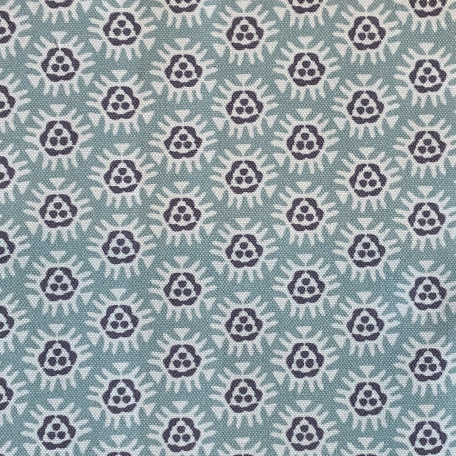
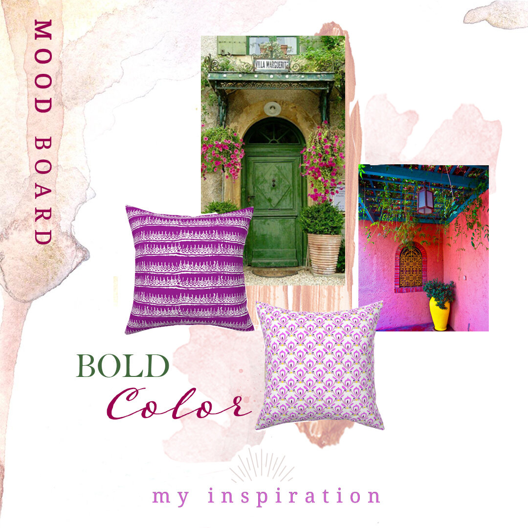
Once the story coalesces into a feeling the real beginning of a design takes shape in my mind. It always involves a feeling, motifs that express the feeling, and colors the feeling evokes. A mood/color board like the one I posted becomes the guide for, in this case: pastel colors, a pop of color, and a relaxed vibe with a slightly global feel. But to be perfectly honest, I most often work from the tear sheets taped to a poster board so I can add/subtract sheets as I progress. It’s much more informal, but a board nonetheless.

I think about where the fabric or pillow will be used. Sometimes that influences the color, but really in the end I lean into where my instincts take me. I don’t necessarily build a collection although yes, some designs are meant to work together, but honestly I prefer the happy coincidence of patterns and colors working together. I’m not overly concerned with being trendy when it comes to what I design for Paprika Home. I love what I love and go with the flow when what I love changes. It’s a pretty good gig and it works for me.

Hope y’all have a wonderful weekend!

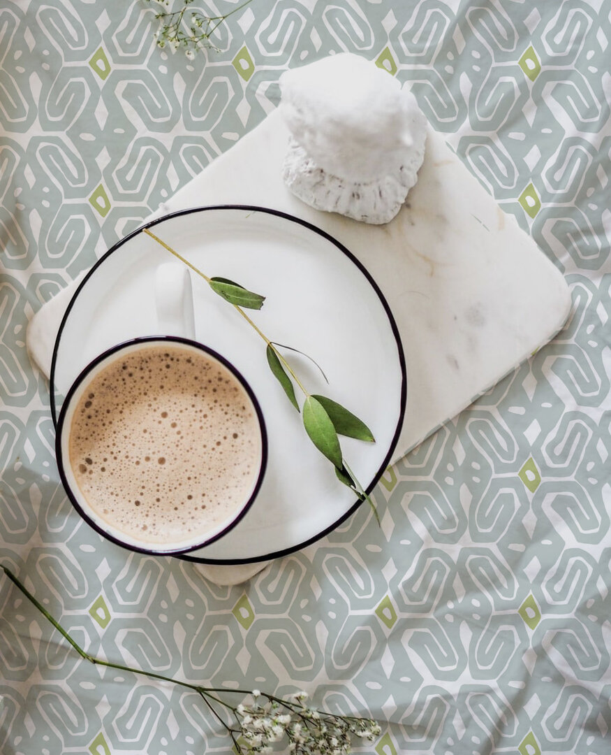
credits: Cottage veranda chair: mainlybaskets.com | La Jolla basket: Serena and Lily | dishes: mydesignchic.com | door: Pinterest